Skip to content
Ester Godoy
Ester Godoy smilingEster Godoy, designer

Brands, feeds and websites with a clear direction, delivered in days.

Design, brand identity, social media and websites. Websites in 1 business day and brand identities in 3 to 5 business days, after visual direction approval.

Try itMove your mouse over my name to reveal the brand colors.Tap my name or scroll to reveal the brand colors.Explore the opening section: my name comes to life in the brand colors.

Ester Godoy

Design, brand identity, social media and websites. Websites in 1 business day and brand identities in 3 to 5 business days, after visual direction approval.

I'm Ester Godoy, a designer.

Brand identity, social media and websites, with a clear direction, delivered in days.

What I do
  • Brand identity

    Brands with strategy, symbols, colors and typography designed around each business's goals.

  • Social media

    Social feeds with a distinctive visual identity that people recognize before reading the name.

  • Websites

    Websites that explain, persuade and turn interest into inquiries, with motion and attention to detail.

Fast delivery

Websites in 1 business day and brand identities in 3 to 5 business days, after visual direction approval.

Design that solves problems

Every visual choice starts with a real business problem: being found, loading quickly, building trust and encouraging people to get in touch.

  • Websites delivered in 1 business dayafter visual direction approval
  • Brand identities in 3 to 5 business daysafter visual direction approval

Three areas of expertise. Every project with its delivery timeline.

Open a folder to explore each client's projects.

Click a cover to open the project

Websites

Hover to explore the full page.Scroll inside the frame to explore the full page.

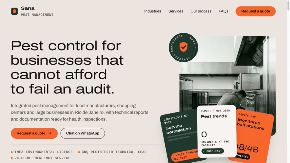
Preview of the Sana Controle Ambiental website1 business day

Sana Controle Ambiental

Website · Pest control

Show businesses that cannot afford to fail an audit that pest control is a technical, documented process.

Read the case study
The challenge
Pest control is often marketed with cartoon insects and alarm-red graphics. But the person hiring for a shopping center or food plant is a manager worried about failing an audit and interrupting operations.
My approach
I designed the website as an audit dossier. It opens with Sana's documents arranged in a fan—certificate, report and bait map—and a compliance seal. Each section answers a question an auditor would ask.
The design decisions
A stone-colored background and deep green suggest a freshly cleaned environment. Orange is reserved for buttons and status indicators. Wide, light typography and technical numerals make the website feel like a report rather than a flyer.
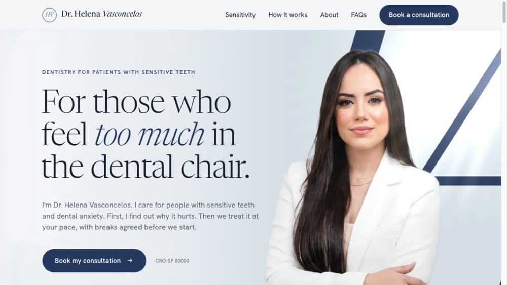
Preview of the Dr. Helena Vasconcelos website1 business day

Dr. Helena Vasconcelos

Website · Dentistry

Welcome patients with dental sensitivity without the cold feel of a clinical website.

Read the case study
The challenge
For someone who feels pain or fear in the dental chair, close-ups of mouths, drills and promises of pain-free treatment only increase anxiety.
My approach
I built the concept of a practice that speaks softly: prominent portraits of the dentist, black-and-white details of care, and a fine-line illustration explaining sensitivity without alarming the reader.
The design decisions
Porcelain tones with carefully placed deep indigo create a sense of calm. A delicate serif highlights emotional words in italics, where patients recognize their own experience. The HV seal appears at three scales to connect the brand. No needles, rating stars or smiling teeth.
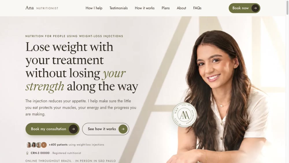
Preview of the Ana Nutritionist website1 business day

Ana Nutritionist

Website · Nutrition

Speak to people using weight-loss injections who are concerned about losing strength along the way.

Read the case study
The challenge
Reach women aged 30 to 55 who use weight-loss injections and worry about muscle loss, side effects and regaining weight, without looking like a miracle weight-loss clinic or a cold medical practice.
My approach
The concept combines the precision of a medical chart with the calm of a thoughtfully set table. Information is organized into steps, plans and questions, while Ana's own portrait leads the page.
The design decisions
Light beige and olive suggest calm and wellbeing without a hospital feel. Olive italics highlight emotional words. Gentle motion, a step-by-step timeline and a rotating seal support an unhurried reading experience.
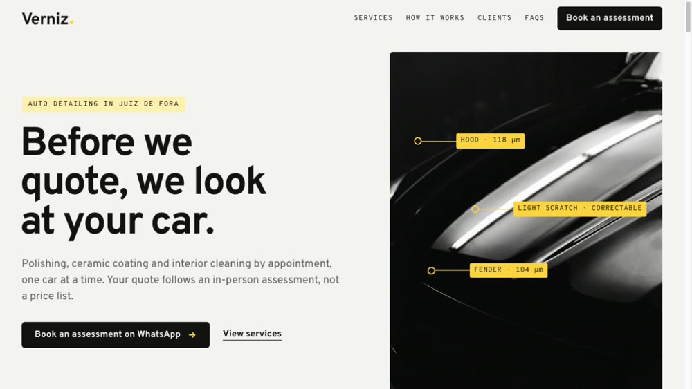
Preview of the Verniz Estética Automotiva website1 business day

Verniz Estética Automotiva

Website · Auto detailing

Show that the car is assessed before a price is quoted.

Read the case study
The challenge
Auto detailing is often sold through loud promotions and claims of being the best in town. This audience treats their car as an asset and wants to know what will be done before hearing a price.
My approach
The concept is that shine comes after the assessment. Yellow inspection marks—dots, lines and measurements—appear over black-and-white photos, while an interactive before-and-after slider shows the result.
The design decisions
Black and white, with yellow reserved for measurements. Confident typography and monospaced figures evoke a technical report. No portraits: the car is the main character.

Brand identity

Brand identities delivered in 3 to 5 business days, after visual direction approval.

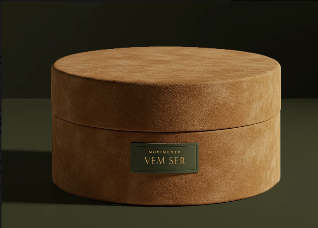
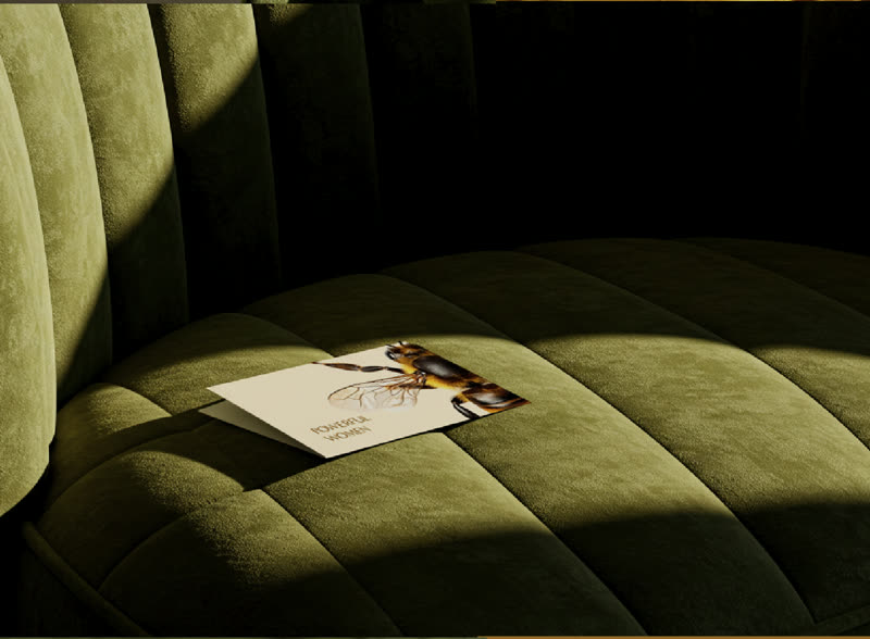
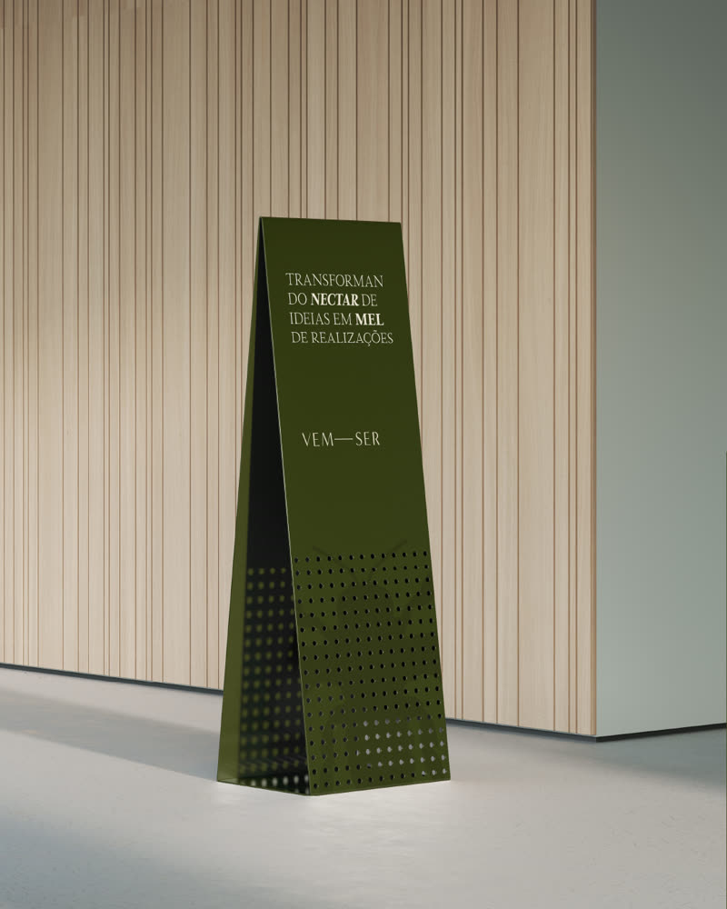
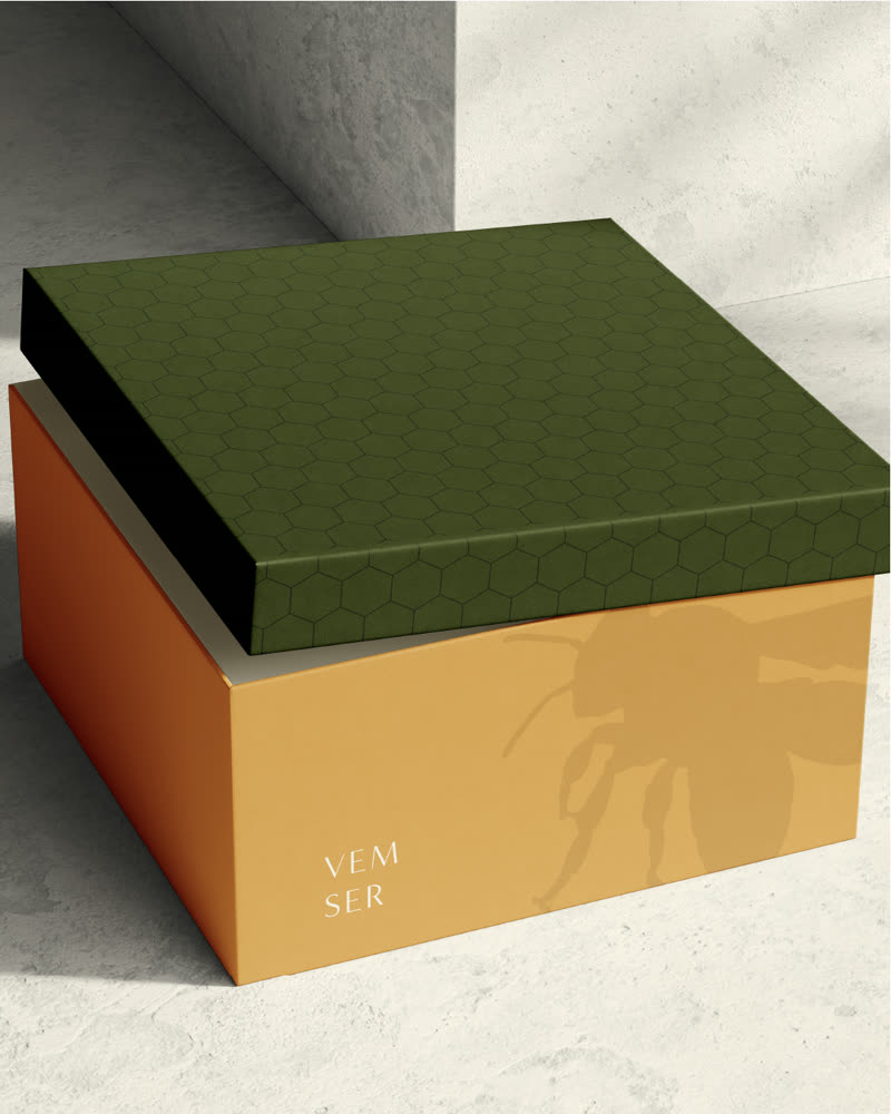
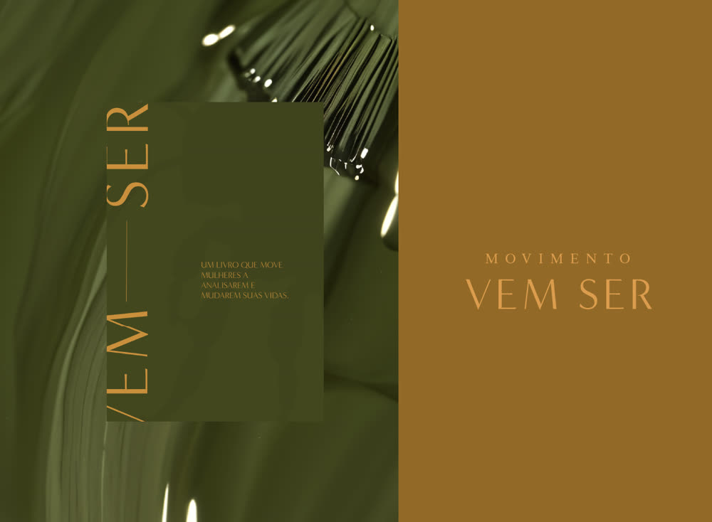
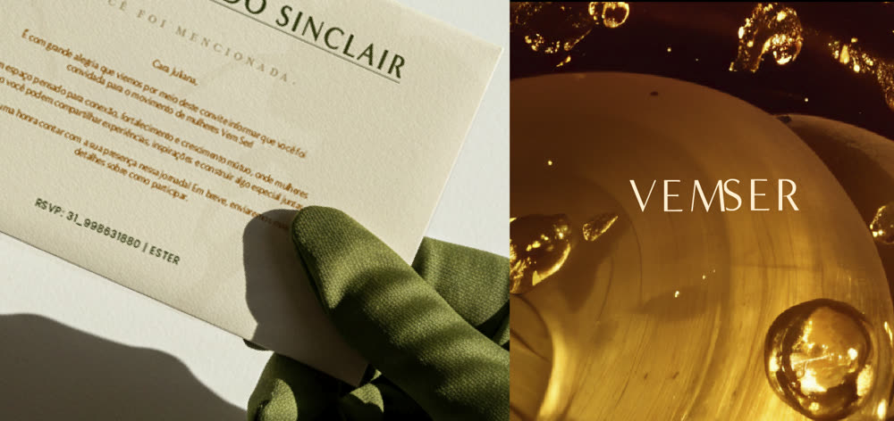
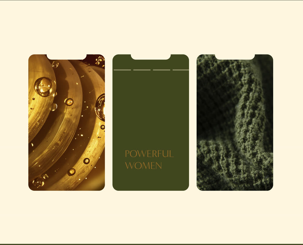
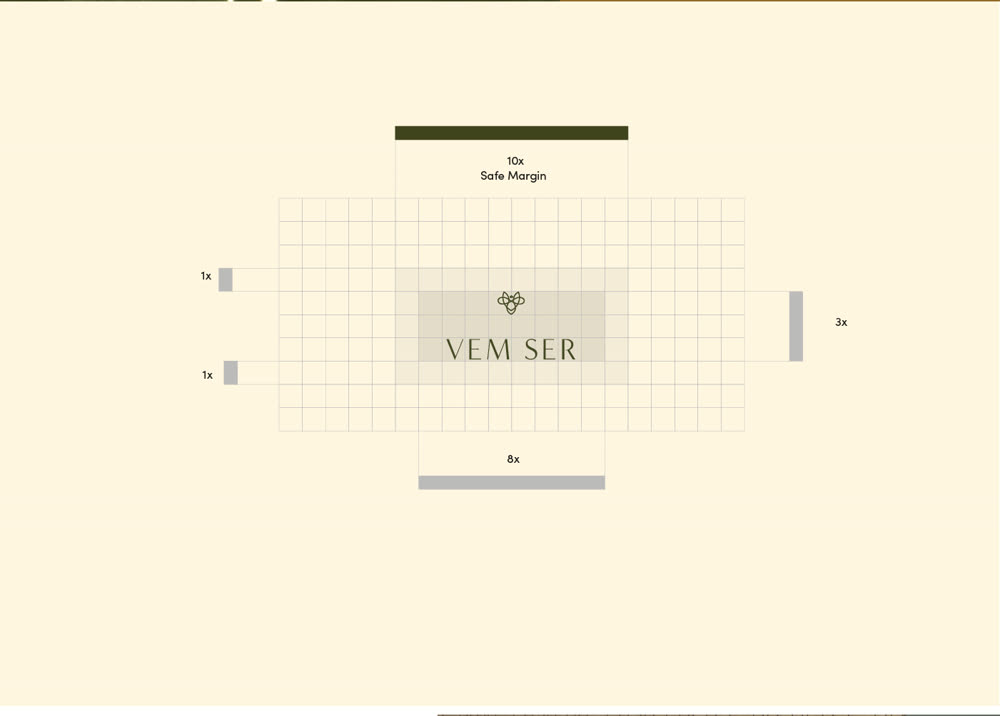
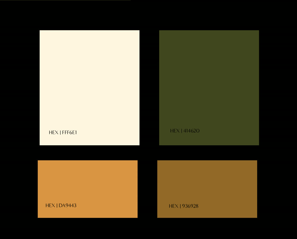
Box featuring the Vem Ser brandBusiness card on a green armchairGreen Vem Ser display standVem Ser brand identity applicationVem Ser business cards in green and caramelVem Ser business card and logo on a gold texturePhone screens featuring the Vem Ser identityVem Ser logo constructionVem Ser color palette

Vem Ser

Brand identity · Women's community

An identity expressing warmth, faith and community for a movement that connects women.

Read the case study
The challenge
Give shape to a movement connecting women through faith and community, with a welcoming brand that avoids obvious visual clichés.
My approach
I created an identity that expresses warmth, faith and community. Each visual decision reinforces the movement's purpose: connecting women, supporting their journeys and inspiring growth together.
The design decisions
Olive, caramel and gold on cream, with tactile materials such as velvet, suede and flowing gold textures, make the brand feel like an embrace. Airy serif typography brings delicacy and a lasting quality, while the palette complements the photography.
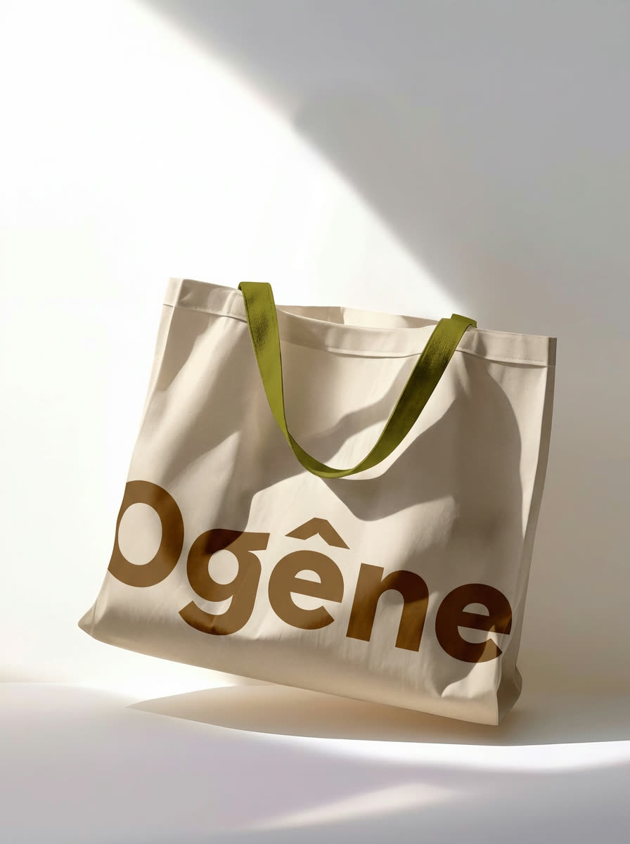
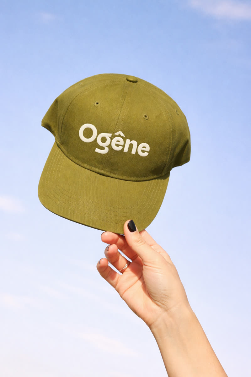
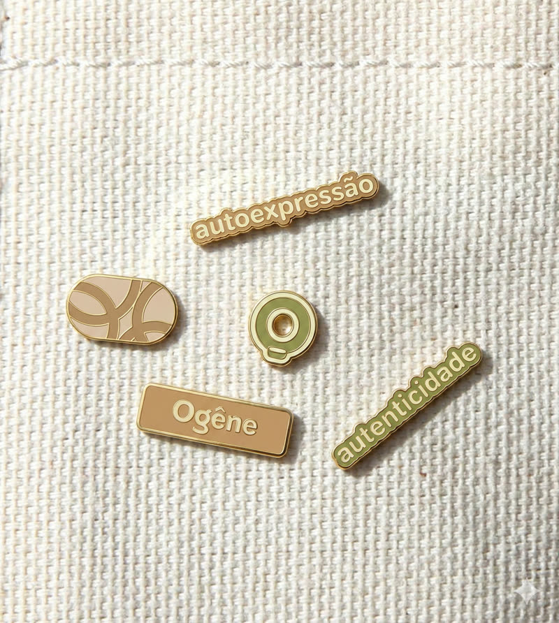
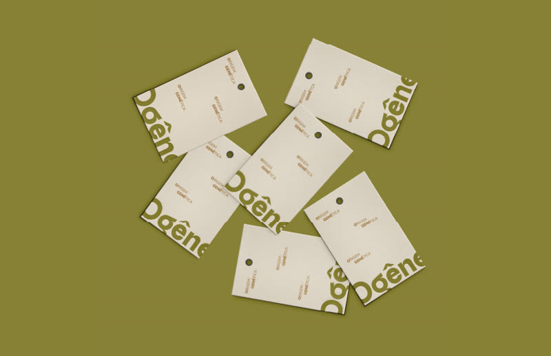
Cotton tote bag featuring the Ogêne brandGreen cap featuring the Ogêne brandOgêne pins and tagsOgêne clothing tags

Ogêne

Naming and identity · Fashion

Naming and identity for inclusive, timeless and accessible fashion.

Read the case study
The challenge
Name and build an inclusive fashion brand that feels timeless and accessible, without relying on campaign clichés.
My approach
I developed the name and identity to express inclusive, timeless and accessible fashion: a brand that communicates authenticity, comfort and belonging.
The design decisions
Olive and caramel evoke clothes made to last. Rounded, substantial lettering feels comfortable, while the circumflex accent becomes a signature. Applications on caps, bags and pins with words such as authenticity bring the idea into everyday life.
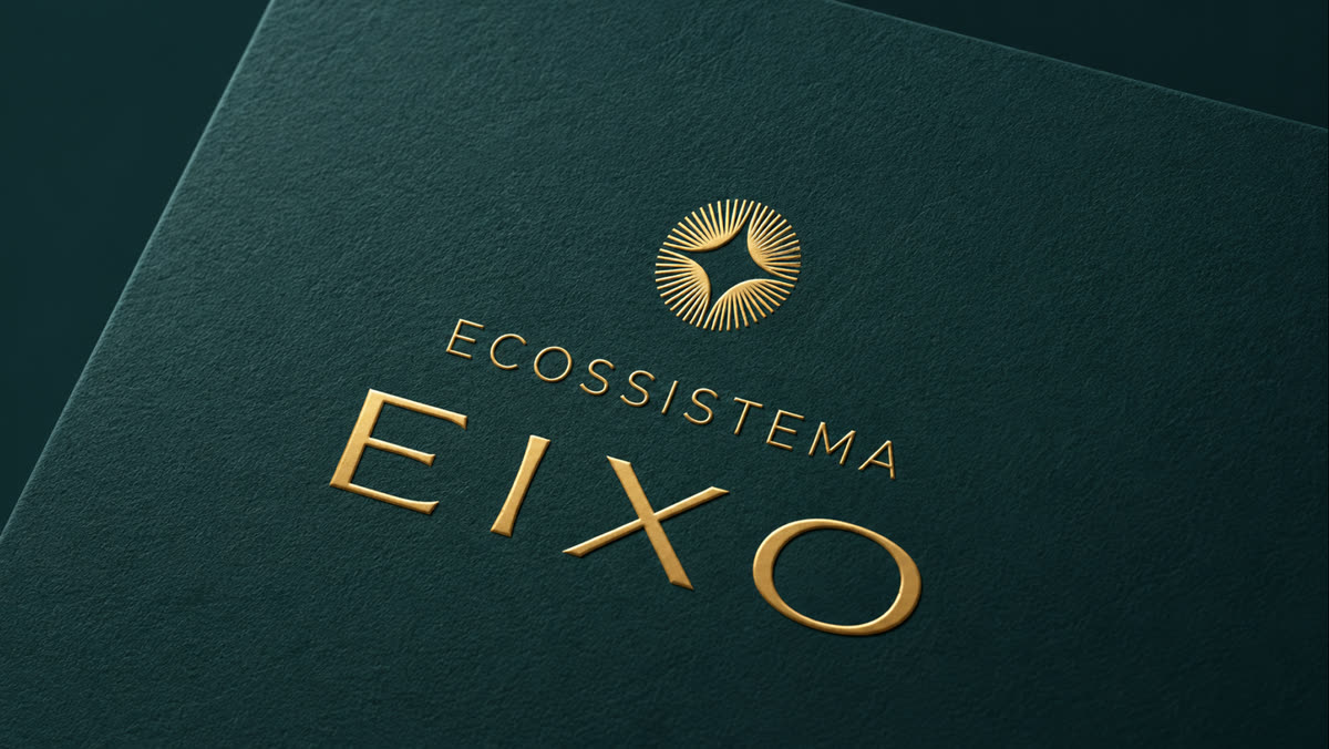
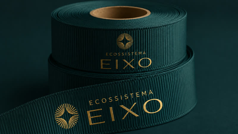
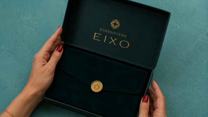
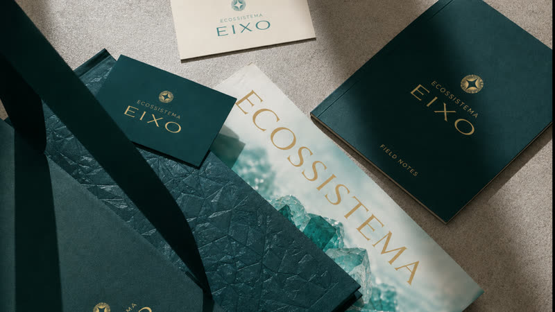
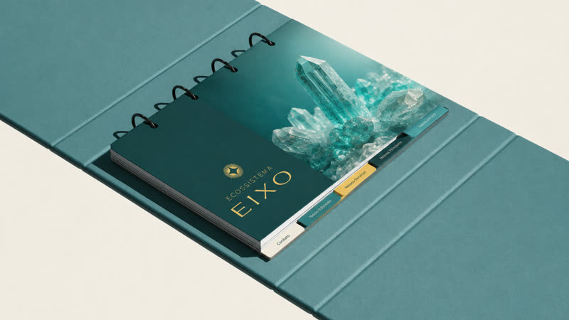
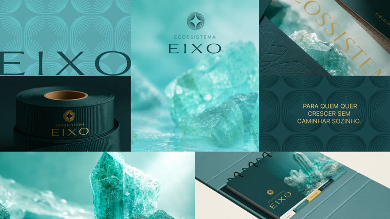
Eixo logo on green ribbonEixo stationeryEixo folder and business cardsGreen cover featuring the Eixo brandEixo digital applicationsOpen Eixo box

Eixo

Brand identity · Business ecosystem

An identity for a business ecosystem that turns connections between entrepreneurs into results.

Read the case study
The challenge
An ecosystem for entrepreneurs whose businesses have outgrown their structures. The brand needed to convey direction and maturity without looking like another training course.
My approach
I built the identity around the Ruler archetype, with a symbol that acts as a point of orientation: the axis around which growth takes shape.
The design decisions
Balanced, restrained typography supports readability and confidence. Institutional dark green stands for stability, tourmaline green for progress, and gold for achievement, with off-white creating breathing room.
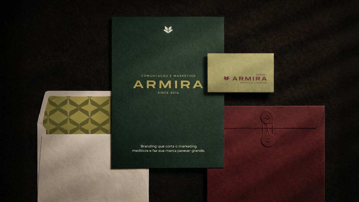
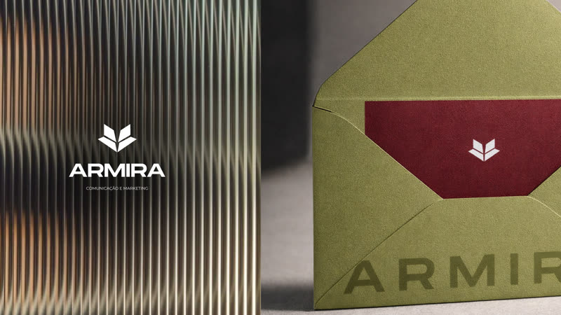
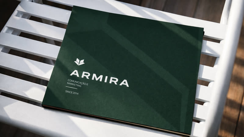
Armira stationery in green and marsalaEnvelope featuring the Armira brandGreen Armira folder on a chair

Armira

Brand identity · Communications and marketing

A blade symbol, marsala and greens for an agency ready to cut through an amateur image.

Read the case study
The challenge
An experienced communications and marketing agency that delivered strong work but looked smaller than it was: a brand lacking authority, unclear differentiation and an amateur appearance.
My approach
I designed a blade symbol representing a break with generic solutions and marketing reduced to posting. Mirrored, upward forms express agility and execution without bureaucracy.
The design decisions
Strong uppercase lettering creates weight and presence. Marsala conveys maturity and understated authority; olive and forest green suggest growth; off-white adds breathing room. The palette moves beyond the usual technology blue of agencies.
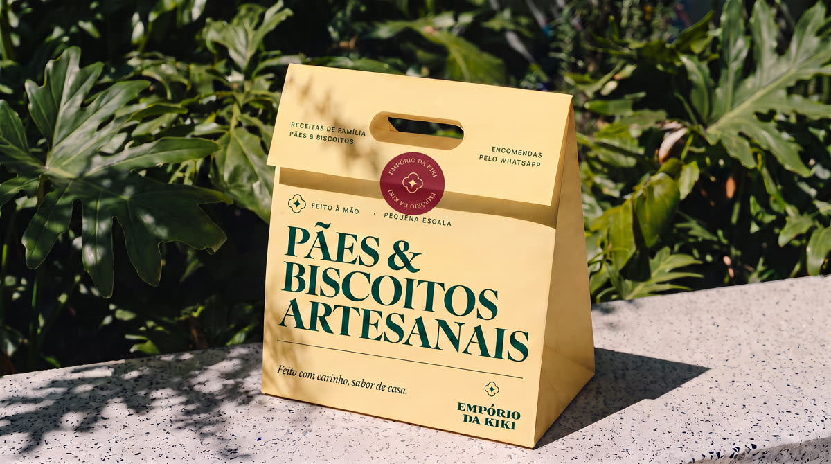
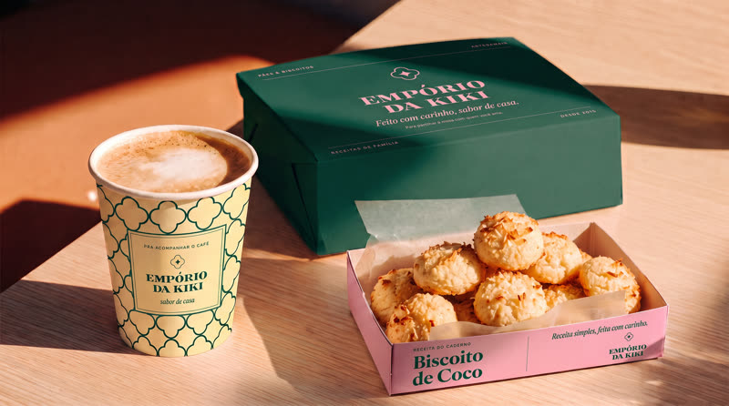
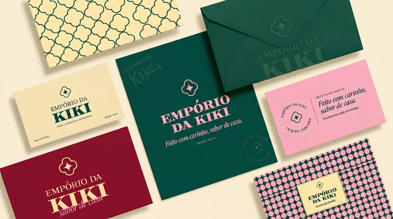
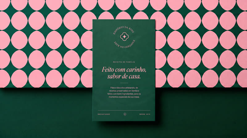
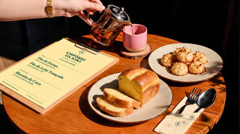
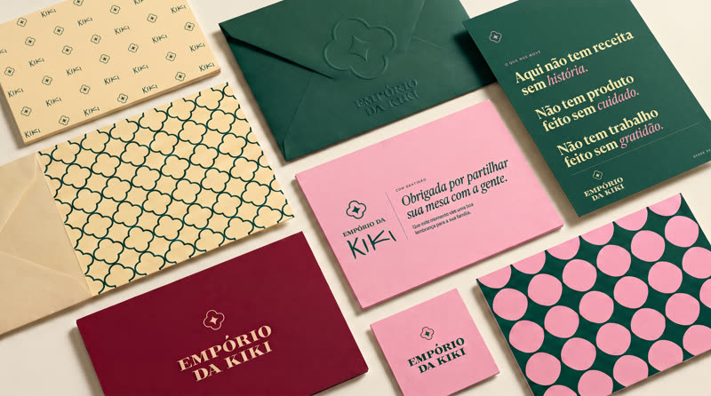
Empório da Kiki shopping bagEmpório da Kiki cup and cookie boxComplete Empório da Kiki stationery setEmpório da Kiki business cardCoffee table with the Empório da Kiki menuEmpório da Kiki stationery

Empório da Kiki

Brand identity · Bread and cookies

Garden green, guava, blossom and butter, with a taste of home.

Read the case study
The challenge
In a crowded market for handmade bread and cookies, customers distrust industrial products but are not always sure of artisan quality. The brand could look neither generic nor extravagant.
My approach
I positioned the shop as family recipes with professional standards: homemade products can offer care, consistency and a polished retail presentation.
The design decisions
Garden green, guava, blossom and butter are warm kitchen colors that do not shout. Classical uppercase serifs convey tradition, tile patterns bring the home into the packaging, and the house flower becomes the symbol.
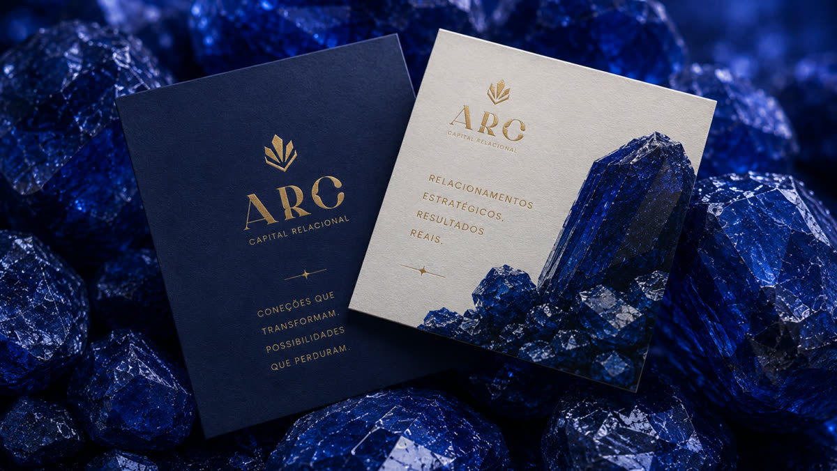
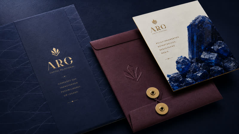
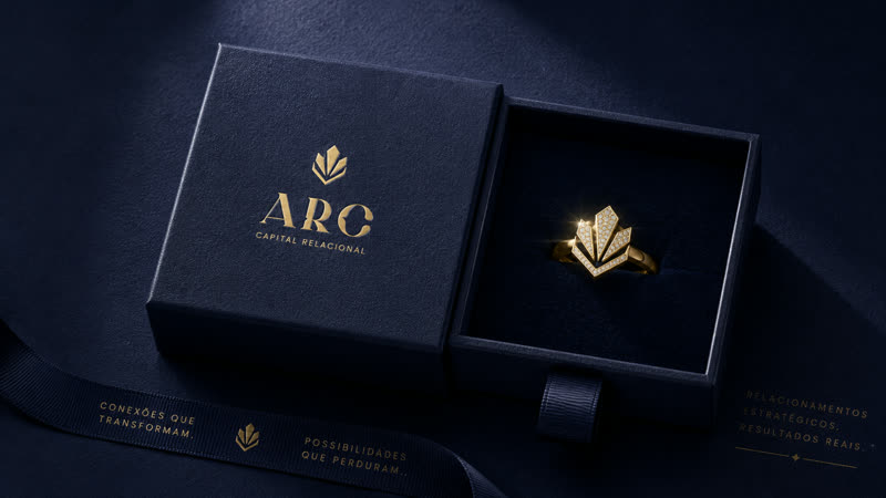
ARC stationery on blue crystalsARC envelope and business cardARC box and business card

ARC

Brand identity

Deep blue and gold, with a symbol that grows like a crystal.

Read the case study
The challenge
Leaders with strong contacts who lose opportunities because they lack structure. The brand needed to sell relationship strategy without networking clichés such as joined hands and knots.
My approach
I created a stylized diamond: raw contacts polished into assets. ARC positions itself as the expert that brings out the value, liquidity and returns in a client's network.
The design decisions
High-contrast serif typography, reminiscent of boutique financial firms, pairs with a light sans serif for the Relational Capital tagline. Dark blue conveys trust, gold suggests returns, burgundy signals quiet power, and light blue expresses the structure of the method.

Social media

Social feeds with a distinctive visual system, from the first post to the last.

Verniz Estética Automotiva — post 1Verniz Estética Automotiva — post 2Verniz Estética Automotiva — post 3Verniz Estética Automotiva — post 4Verniz Estética Automotiva — post 5Verniz Estética Automotiva — post 6Verniz Estética Automotiva — post 7Verniz Estética Automotiva — post 8Verniz Estética Automotiva — post 9

Verniz Estética Automotiva

Social feed · Auto detailing

Black, yellow and detailed photography: the car as an asset.

Read the case study
The challenge
Move away from the promotional feed every car wash uses.
My approach
I created posts with yellow inspection graphics over detailed photographs and short lines explaining the care involved.
The design decisions
Black and yellow, with one idea per post: treating the car as an asset rather than a special offer.
Dr. Helena Vasconcelos — post 1Dr. Helena Vasconcelos — post 2Dr. Helena Vasconcelos — post 3Dr. Helena Vasconcelos — post 4Dr. Helena Vasconcelos — post 5Dr. Helena Vasconcelos — post 6Dr. Helena Vasconcelos — post 7Dr. Helena Vasconcelos — post 8Dr. Helena Vasconcelos — post 9

Dr. Helena Vasconcelos

Social feed · Dentistry

Calm posts for people with dental anxiety.

Read the case study
The challenge
Speak to people who fear the dentist without using distressing imagery.
My approach
I built a feed alternating portraits, messages and details of care, using the same quiet tone as the website.
The design decisions
Deep indigo and porcelain, serif typography with emotional words in italics, and generous breathing room in every post.
Sana Controle Ambiental — post 1Sana Controle Ambiental — post 2Sana Controle Ambiental — post 3Sana Controle Ambiental — post 4Sana Controle Ambiental — post 5Sana Controle Ambiental — post 6Sana Controle Ambiental — post 7Sana Controle Ambiental — post 8Sana Controle Ambiental — post 9

Sana Controle Ambiental

Social feed · Pest control

The feed follows the website's visual system: technical, organized and free of cartoon insects.

Read the case study
The challenge
Bring the website's rigor to Instagram, with content a quality manager would actually save.
My approach
I designed posts that work like documents: reports, audit checklists and a compliance seal.
The design decisions
The website's stone, green and signal-orange palette, with technical numerals, lets followers recognize Sana before reading the name.
Ana Nutritionist — post 1Ana Nutritionist — post 2Ana Nutritionist — post 3Ana Nutritionist — post 4Ana Nutritionist — post 5Ana Nutritionist — post 6Ana Nutritionist — post 7Ana Nutritionist — post 8Ana Nutritionist — post 9

Ana Nutritionist

Social feed · Nutrition

Posts for people using weight-loss injections who want to maintain their strength.

Read the case study
The challenge
Bring the website's sense of calm to Ana's profile for people discovering her through Instagram.
My approach
I organized the grid like a board: photos in positions 1, 5 and 9, deep olive and olive in 3 and 7, and light posts between them.
The design decisions
The whole profile feels like a single page, while every post remains readable on its own.
Marieli — post 1Marieli — post 2Marieli — post 3Marieli — post 4Marieli — post 5

Marieli

Social media and print · Engineering

Visual communication that balances authority and approachability, turning technical services into a desirable brand.

Read the case study
The challenge
A civil engineer serving a discerning audience. Technical services, such as building design and fire-safety planning, needed a desirable brand without looking plain or cluttered.
My approach
I took a less-is-more approach, with elegance built through hierarchy. The feed alternates photography, solid color and project imagery. Carousel covers feature her portrait, with a repeated object inside to make the profile feel like a collection.
The design decisions
Navy, olive, sand and cream. Italic serif titles with a gold texture. Materials from her world, such as plaster and cement, never fabric. No gradients: soft shadows create contrast over photographs.
Dr. Marcela Farid — post 1Dr. Marcela Farid — post 2Dr. Marcela Farid — post 3Dr. Marcela Farid — post 4

Dr. Marcela Farid

Creative assets · Aesthetics

Creative assets that express the doctor's essence: elegance, confidence and care.

Read the case study
The challenge
Express the doctor's elegance, confidence and care through video covers viewed for a fraction of a second on a small screen.
My approach
Photographs of her in the real clinic, with two layers of typography: a light introductory line above a bold key word, alongside the brand monogram.
The design decisions
Gold and white over photography retain sophistication. The contrast between light lettering and strong capitals makes the message easy to read in the feed.

Want to see more or discuss a job opportunity?

Chat on WhatsApp

What it's like to work with me.

  • “Working with Ester was easy from start to finish. She understands the brief quickly, proposes solutions with confidence and delivers everything on time.”
    Eduardo
  • “Ester delivers quality work with speed and responsibility. Clear communication, a strong command of her tools and complete commitment to deadlines.”
    Junior
  • “Outstanding work. Ester captured exactly what my client's brand stood for and turned it into a professional visual identity. He loved it, and we were delighted.”
    Marina

How I work

When you hire me directly

  1. Briefing

    I learn about the business, its audience and the problem the project needs to solve.

  2. Research

    I study the brief, the market and visual references before designing.

  3. Strategy

    I define the message, content hierarchy and direction of the project.

  4. Visual alignment and creative direction

    I present the direction and move forward only after your approval.
    From this point: websites in 1 business day Brand identities in 3 to 5 business days

  5. Initial concepts

    Early compositions to test the direction in practice.

  6. Refinement

    I refine proportions, typography, color and detail.

  7. Production

    I finalize the designs and their applications.

  8. Presentation

    I deliver organized files and explain the design decisions.

When I join a team or agency

I work within your process: joining at the brief or an established direction and taking ownership of design, refinement and delivery.

  1. I receive

    The brief or direction your team has already defined.

  2. I design and refine

    The assets within the brand's visual system.

  3. I deliver

    To your team's deadline, with organized files.

Ester Godoy smiling, seated with an iPad and stylus

Hi, I'm Ester.

A multidisciplinary designer with 6 years of experience.

I work across design and communication, always focusing on what makes sense for the business. I'm curious, proactive and fully involved in every project.

I enjoy solving problems, organizing processes and turning ideas into work that delivers results. I work as part of the team, committed to the business's success.

  • Experience6 years of end-to-end design and communication
  • MethodThe NVME® Method, my own process for developing each brand's strategy and identity
  • ExpertiseBrand identity, social media and websites
Design that works

Beautiful, and built to solve problems.

Every project starts with a specific client need: to be remembered, recognized or found. The visual direction follows from that. This portfolio brings that approach to life through animation, dark mode and a name that reveals the brand colors as you interact with it.

  • WebsitesBeautiful does not have to mean slow: discoverable, fast on mobile and designed to turn interest into inquiries.
  • Brand identityStrategy comes first: the business challenge shapes the symbol, colors and typography.
  • Social mediaA distinctive visual system that people recognize before reading the name.
100PageSpeedPerformance 100Accessibility 100Best practices 100SEO 100Measured on the Portuguese version of this portfolio.Check the Portuguese version

Have a role or a project in mind? Let's talk.